For my media product, I created a house style that is reminiscent of the Pop-Punk genre in order to ensure continuity. I did this by firstly ensuring that my front cover, contents page and double page spread used the same colour scheme throughout, being blue/black, white/grey and red.
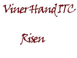
I used the same fonts throughout my media products those fonts being...
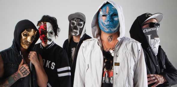
The artist on every piece was the same, my own fictional band of The Boston Buried. This band matches conventions in a number of ways. For starters, they are a primarily rap-rock band, and are equipped with the clothing and props similar to that of a primarily rap-centered artist/group, such as hoodies, as seen here.
However, the masks are definitely a challenge to conventions of the genre, as almost no band, not even specifically in the rap-rock genre, are know for wearing masks. The only other band that does this is the band that I drew inspiration from, Hollywood Undead
The colour scheme used for my media products is non-typical, and challenges conventions of pop-punk. My colour scheme contains primarily dark colours, through the dark blue background and the dark grey hoodies, and even bright masks. The most well-known band from the genre, Hollywood Undead, uses either all dark or all bright colour schemes, unlike the Boston Buried which sports a mixture such as dark grey and light red.


No comments:
Post a Comment