Thursday, 25 February 2016

7. Looking back at your preliminary task, what do you feel you have learnt in the progression from it to the full product?

In the months that followed from the creation of my preliminary college magazine cover, to my actual music magazine  cover, I feel as though the progression was very good and clearly demonstrated how I learned to use photo editing software over the course of the year.


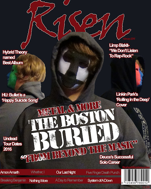
Shown here, my final front cover has many features and qualities that would only be possible with a high level of understanding of the photo editing software Photoshop.

Looking at my preliminary task, it seems very lackluster and primitive in comparison to my final cover. The masthead is very basic, and all text is simply enlarged Arial, and in different colours. Whereas the final product has three different font types, (Viner Hand ITC, Gill Sans MT and Arial) and utilises several of the advanced tools that Photoshop offers, such as free transform, the linking and transformation of layers, and the addition of effects (such as the grime effect on 'The Boston Buried'.
The main image on this preliminary cover was plain and uninspiring, and overall bland. It made the simplicity of my original cover look even more plain. 

However, for my music product, I learned that creativity was the key to a good cover, so took numerous photos and conglomerated the best and most fitting ones into positions that created the illusion of several people, from only one. For this, spacing and placement was key, so I changed the positioning of the members several times to get the feel of depth, just right. 


Additionally I learned how to use the crop and lasso tools in order to remove the background from the multiple photos I took for my coursework and place me onto my three products. This also required knowledge of taking layers from one Photoshop file and inserting them into another, which I also learned how to do after the creation of my college magazine. Additionally, something as basic as adjusting the rotation of text on the page was absent from my college magazine, and the subheadings were far too big and seemed awkwardly placed on the page, as did the masthead with it being plastered over half my head. 


6. What have you learned about technologies from the process of constructing the product?

Throughout the creation of my media products, I learned a lot about several technologies. Primarily, Photoshop.


 Clearly Photoshop was the primary tool I used to create my media products, as the level of editing and polish would not be possible in other products or software (namely paint, Microsoft office etc.)


For example, here on my front cover, the masthead, headlines and practically everything was produced in Photoshop.

The images I took where cropped with Photoshop tools, placed into Photoshop and positioned in it too. Using the tools to position the primary figure in the grey hoodie behind the other members was done thanks to Photoshop. Additionally, after changes in positioning were suggested by my teacher, it was incredibly easy to hide layers and use free-transform to edit the size and positioning of the band members, in order to create a better sense of depth.

Throughout the course of the creation of my three products I not only gained insight into how Photoshop works, but how it can be used to manipulate any image and to bring something new into existence through nothing but other photographs.


5. How did you attract/address your audience?

Firstly, to attract or adress my media audience, I had to know what would appeal to them and their demographic. considering that my genre is a hybrid of two popular genres, I had a choice to make.

Because rock and rap are so different, in terms of music and also in terms of appearance and overall look, I had to decide which way to lean, as rap-rock itself has no defining style of its own in term of attire.

 I could either choose to go with the rap route, and base the design of my media product off of rap icons, such as Snoop Dog with their hoodies and dark attire...


Or I could take inspiration from the rock genre, outfitting my media product with the iconography of icons such as slash, with things such as piercings, long hair, and band-inspired shirts.


I knew that either one would attract an audience, as both rock and rap are incredibly popular genres (rock being more popular in recent years, show by this study, would have been a better choice.)

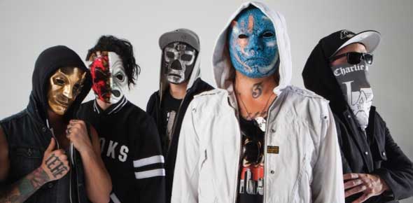
But I decided on neither, and went with Hollywood Undead as my inspiration. Being already in the rock-rap genre, and being the most popular artist in the genre to boot, it was a good idea to take inspiration from them, in order to gain interest from people who already fans of them, and the genre.


This style would resonate with current fans of the genre, as it's what they would be familiar with. I know this because rock-rap is a relatively small genre, so it is very likely that if a person was a fan, they would know of Hollywood Undead, so shaping my media product around them would attract more of an audience. In this way, it could be said that by selecting the rap-rock genre, I set myself up to address/attract a niche audience.


4. Who would be the audience for your media product?

Because of the genres of music that my magazine associates with, being rap-rock, pop-punk and metal, the target audience would be very similar to that of Kerrang magazine. Because of this, I used a kerrang readership chart to determine who my audience would be.


From the information on this graph, I deduced that it would be most effective to aim for an audience similar to the 15-24 range, as that is kerrang's clearly dominant demographic. I decided that aiming for this age range would be a no-brainer, as it provides over half of Kerrang's readership. Moreover, males are the slightly more interested in Kerrang magazine than women, so in my media product I used a colour scheme that contained colours more associated with males than females, being blue and red (rather than say, lighter purples or pinks etc). Additionally, while the decision to have one individual appear as a whole band was a creative decision, it could be seen as a bonus that a male star would be more appealing to a male audience, so benefits in more than one way.

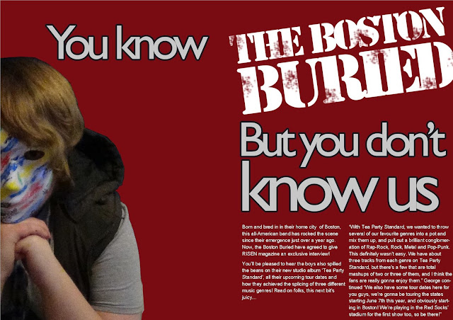
Here are my products again, so you can understand and gauge my decisions by viewing the actual product.


Specifically, I believe the audience for my products would be a niche audience interested in hybrid genres, as well as having at least a mild interest in rap and/or rock. This is because my products are based on the style, look and hybrid genre of Hollywood Undead who adopt rap and rock genre conventions in both their lyrics and style. Fans of hollywood Undead would theoretically be fans of the Boston Buried, as I tried to make them as similar as possible with the addition of masks.


3. What kind of media institution might distribute your media product and why?

Institution-An establishment that handles the production, distribution and sale of a product (often profit based)


The media institution I based my media products on was Big Cheese Magazine.


This is because they focused on genres of music that I either selected, or are similar to the ones I selected, as seen here. This screenshot of Big Cheese's website shows that they already produce for rap-rock bands, ergo how I was able to take inspiration from them in the first place, via their Hollywood Undead cover.


Big Cheese actually distributed via it's own company, as seen below it was 'Big Cheese Publishing ltd' and was not part of a larger institution.


The primary company that would be likely to publish my magazine is one that does not already have a rap-rock genre of magazine currently being published. Selections include such institutions as AEI and UKF.


UKF (United Kingdom and Frome) deals in artists focused primarily around electronic and bass music, and have no ties or associations with magazines. For this reason, I believe UKF would distribute my media product, as by doing so they would extend their influence into new genres and the magazine industry simultaneously, giving major advantages such as a dramatically increased audience size and possible revenue. Additionally, the fact that UKF was founded in 2007 means that it has had a lot of time to grow and possibly become part of a conglomerate, and in doing so increasing expendable income that it could use to fund my magazine.


Moreover, AEI  would also be a good candidate for distributing my media product, for similar reasons. AEI foucuses primarily on bass music, and also does not currently have its own magazine in any genre. So, being distributed by AEI would reap all the same benefits as UKF. However, AEI is the better choice for several reasons.

Firstly, this company has its own separate label for music-central bussiness, known as AEI music.


Additionally, AEI has had the opportunity to (and has) become part of a conglomerate, being around since 1998. This means that they would be willing to produce, distribute and sell my magazine, as they would be vertically integrated. Further support of AEI being a good choice to distribute my magazine is the fact that they have spread their influence to the states by distributing in america., meaning that they could easily distribute my magazine not only in tihs country, but worldwide. Additionally and surprisingly, AEI has its headquarters in London meaning that if nothing else it would be incredibly easy to get a simple distribution deal with AEI without any hefty overseas transactions.

2. How does your media product represent particular social groups?

Throughout the creation of my media project, I aimed to create imagery associated primarily with rap, as the genre my magazine is centred around is rap-rock. In turn, I represented the younger generation, and middle to lower class social groups.


I wanted my media product to be priced to suit the working class, as my genre of rap-rock and similar genres such as pop-punk are popular with the working class (specifically, C1, C2, D and possibly E)


For this reason, the price of my magazine is clearly stated below the bar code, at the very reasonably price of £4.99, a price which would be affordable to my target audience(s)

1. In what ways does your media product use, develop or challenge forms and conventions of media products?


For my media product, I created a house style that is reminiscent of the Pop-Punk genre in order to ensure continuity. I did this by firstly ensuring that my front cover, contents page and double page spread used the same colour scheme throughout, being blue/black, white/grey and red.

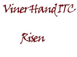
I used the same fonts throughout my media products those fonts being...


The artist on every piece was the same, my own fictional band of The Boston Buried. This band matches conventions in a number of ways. For starters, they are a primarily rap-rock band, and are equipped with the clothing and props similar to that of a primarily rap-centered artist/group, such as hoodies, as seen here.


However, the masks are definitely a challenge to conventions of the genre, as almost no band, not even specifically in the rap-rock genre, are know for wearing masks. The only other band that does this is the band that I drew inspiration from, Hollywood Undead


The colour scheme used for my media products is non-typical, and challenges conventions of pop-punk. My colour scheme contains primarily dark colours, through the dark blue background and the dark grey hoodies, and even bright masks. The most well-known band from the genre, Hollywood Undead, uses either all dark or all bright colour schemes, unlike the Boston Buried which sports a mixture such as dark grey and light red.


Friday, 5 February 2016

Front Cover Creation

This is the second draft of my magazine front cover. These three images show the progression of my cover, after the images where cropped and placed onto the cover itself.


At this stage in the development, the main headline and the quotes had not yet been rotated to the left, and looked slightly plain without the grime effect.


This was prior to the introduction of the masthead and any of the headings, and when the members where arranged in another, more clunky position. This was also prior to the masthead being moved behind the primary member.


This was the front cover from where I took the majority of my inspiration, An issue of Big Cheese Magazine with Hollywood Undead gaining a place on the cover. The masthead is behind the heads of the members in this cover, and I decided that only the center member should be placed ahead of the logo in my front cover.

Usable Front Cover Photos

                          Usable Front Cover Photos


Because I plan to make one person appear as a whole band, it was imperative that I took a very large amount of photos. Out of the 160 that I took, here are the possible candidates to put on my front cover.

Keep in mind, I plan to make 4 band members: one on the left facing left, one on the right facing right, a center member stood up, and a center member crouched.


Here is the main member positioning I'm considering. The one above this image is an alternate version with the side members flipped.