
Wednesday, 20 April 2016

Tuesday, 19 April 2016


Thursday, 25 February 2016
7. Looking back at your preliminary task, what do you feel you have learnt in the progression from it to the full product?
In the months that followed from the creation of my preliminary college magazine cover, to my actual music magazine cover, I feel as though the progression was very good and clearly demonstrated how I learned to use photo editing software over the course of the year.
 Shown here, my final front cover has many features and qualities that would only be possible with a high level of understanding of the photo editing software Photoshop.


Looking at my preliminary task, it seems very lackluster and primitive in comparison to my final cover. The masthead is very basic, and all text is simply enlarged Arial, and in different colours. Whereas the final product has three different font types, (Viner Hand ITC, Gill Sans MT and Arial) and utilises several of the advanced tools that Photoshop offers, such as free transform, the linking and transformation of layers, and the addition of effects (such as the grime effect on 'The Boston Buried'.

The main image on this preliminary cover was plain and uninspiring, and overall bland. It made the simplicity of my original cover look even more plain.

However, for my music product, I learned that creativity was the key to a good cover, so took numerous photos and conglomerated the best and most fitting ones into positions that created the illusion of several people, from only one. For this, spacing and placement was key, so I changed the positioning of the members several times to get the feel of depth, just right.
Additionally I learned how to use the crop and lasso tools in order to remove the background from the multiple photos I took for my coursework and place me onto my three products. This also required knowledge of taking layers from one Photoshop file and inserting them into another, which I also learned how to do after the creation of my college magazine. Additionally, something as basic as adjusting the rotation of text on the page was absent from my college magazine, and the subheadings were far too big and seemed awkwardly placed on the page, as did the masthead with it being plastered over half my head.
6. What have you learned about technologies from the process of constructing the product?
Throughout the creation of my media products, I learned a lot about several technologies. Primarily, Photoshop.

Clearly Photoshop was the primary tool I used to create my media products, as the level of editing and polish would not be possible in other products or software (namely paint, Microsoft office etc.)
For example, here on my front cover, the masthead, headlines and practically everything was produced in Photoshop.
 The images I took where cropped with Photoshop tools, placed into Photoshop and positioned in it too. Using the tools to position the primary figure in the grey hoodie behind the other members was done thanks to Photoshop. Additionally, after changes in positioning were suggested by my teacher, it was incredibly easy to hide layers and use free-transform to edit the size and positioning of the band members, in order to create a better sense of depth.
Throughout the course of the creation of my three products I not only gained insight into how Photoshop works, but how it can be used to manipulate any image and to bring something new into existence through nothing but other photographs.

Clearly Photoshop was the primary tool I used to create my media products, as the level of editing and polish would not be possible in other products or software (namely paint, Microsoft office etc.)

Throughout the course of the creation of my three products I not only gained insight into how Photoshop works, but how it can be used to manipulate any image and to bring something new into existence through nothing but other photographs.
5. How did you attract/address your audience?
Firstly, to attract or adress my media audience, I had to know what would appeal to them and their demographic. considering that my genre is a hybrid of two popular genres, I had a choice to make.


Because rock and rap are so different, in terms of music and also in terms of appearance and overall look, I had to decide which way to lean, as rap-rock itself has no defining style of its own in term of attire.

I could either choose to go with the rap route, and base the design of my media product off of rap icons, such as Snoop Dog with their hoodies and dark attire...

Or I could take inspiration from the rock genre, outfitting my media product with the iconography of icons such as slash, with things such as piercings, long hair, and band-inspired shirts.
I knew that either one would attract an audience, as both rock and rap are incredibly popular genres (rock being more popular in recent years, show by this study, would have been a better choice.)


But I decided on neither, and went with Hollywood Undead as my inspiration. Being already in the rock-rap genre, and being the most popular artist in the genre to boot, it was a good idea to take inspiration from them, in order to gain interest from people who already fans of them, and the genre.


This style would resonate with current fans of the genre, as it's what they would be familiar with. I know this because rock-rap is a relatively small genre, so it is very likely that if a person was a fan, they would know of Hollywood Undead, so shaping my media product around them would attract more of an audience. In this way, it could be said that by selecting the rap-rock genre, I set myself up to address/attract a niche audience.
4. Who would be the audience for your media product?
Because of the genres of music that my magazine associates with, being rap-rock, pop-punk and metal, the target audience would be very similar to that of Kerrang magazine. Because of this, I used a kerrang readership chart to determine who my audience would be.

From the information on this graph, I deduced that it would be most effective to aim for an audience similar to the 15-24 range, as that is kerrang's clearly dominant demographic. I decided that aiming for this age range would be a no-brainer, as it provides over half of Kerrang's readership. Moreover, males are the slightly more interested in Kerrang magazine than women, so in my media product I used a colour scheme that contained colours more associated with males than females, being blue and red (rather than say, lighter purples or pinks etc). Additionally, while the decision to have one individual appear as a whole band was a creative decision, it could be seen as a bonus that a male star would be more appealing to a male audience, so benefits in more than one way.
Here are my products again, so you can understand and gauge my decisions by viewing the actual product.
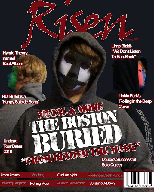

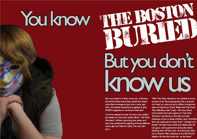
Specifically, I believe the audience for my products would be a niche audience interested in hybrid genres, as well as having at least a mild interest in rap and/or rock. This is because my products are based on the style, look and hybrid genre of Hollywood Undead who adopt rap and rock genre conventions in both their lyrics and style. Fans of hollywood Undead would theoretically be fans of the Boston Buried, as I tried to make them as similar as possible with the addition of masks.

From the information on this graph, I deduced that it would be most effective to aim for an audience similar to the 15-24 range, as that is kerrang's clearly dominant demographic. I decided that aiming for this age range would be a no-brainer, as it provides over half of Kerrang's readership. Moreover, males are the slightly more interested in Kerrang magazine than women, so in my media product I used a colour scheme that contained colours more associated with males than females, being blue and red (rather than say, lighter purples or pinks etc). Additionally, while the decision to have one individual appear as a whole band was a creative decision, it could be seen as a bonus that a male star would be more appealing to a male audience, so benefits in more than one way.
Here are my products again, so you can understand and gauge my decisions by viewing the actual product.


Specifically, I believe the audience for my products would be a niche audience interested in hybrid genres, as well as having at least a mild interest in rap and/or rock. This is because my products are based on the style, look and hybrid genre of Hollywood Undead who adopt rap and rock genre conventions in both their lyrics and style. Fans of hollywood Undead would theoretically be fans of the Boston Buried, as I tried to make them as similar as possible with the addition of masks.
Subscribe to:
Posts (Atom)